Color
The color we see is how our brain visually perceive the world. The color of an object is determined by the different wavelengths of light it reflects (and absorbs), which is affected by the object’s physical properties.

Color is a perception, not the physical property of an object … though it’s affected by the object’s properties.
Characteristics of color
Any color can be described by three fundamental attributes:
Hue The dominant color: what we name as red, yellow, green, blue, etc. This is what distinguishes a red apple from a green one.
Saturation (chroma) How pure or vivid the color is. A fully saturated color is intense and contains no white or gray; a desaturated color appears dull or washed out.
Lightness / Brightness / Value How light or dark the color is, ranging from black to white. Different models use different names (value in HSV, lightness in HSL), but the idea is the same.
Human eye and visible spectrum
Light is a part of the electromagnetic radiation that is visible to the human eye. The visible spectrum spans wavelengths from approximately 380 nm (violet) to 780 nm (red). Colors corresponding to a single wavelength are called spectral colors e.g. light at 570 nm produces a pure spectral yellow.

The human eye does not respond uniformly to all wavelengths. It is trichromatic, it contains three types of photo-receptors called cones that are sensitive to different but overlapping ranges of wavelengths:
S-cones (short-wavelength) Peak sensitivity around 420–440 nm (blue-violet). These cones have the narrowest response curve and are most sensitive to the short-wavelength end of the visible spectrum.
M-cones (middle-wavelength) Peak sensitivity around 534–555 nm (green). They respond strongly to the middle of the visible spectrum and overlap significantly with L-cones.
L-cones (long-wavelength) Peak sensitivity around 564–580 nm (yellow-green), not red. Our perception of red comes from the long tail of L-cone sensitivity combined with very low M-cone response at those wavelengths.
The graph below shows the normalized response of each cone type across the visible spectrum.

White is not a spectral color, no single wavelength produces it. We perceive white when S, M, and L cones are stimulated at similar levels by a broad mix of wavelengths (like sunlight). This is also why RGB displays mix red, green, and blue subpixels to produce white.
Because the retina has three different cone types, any color sensation can be matched using just three primary colors with varying intensities. This property is called trichromacy and is the foundation of all RGB display technologies.
The responses of the S, M, and L cones form the basis of the LMS color space, a color space defined directly by the human visual system’s physiological response. Most other color spaces (RGB, XYZ, Lab) are derived from or calibrated against this fundamental space.
In addition to cones, the eye also contains rods, highly light-sensitive receptors that handle vision in low-light conditions (scotopic vision). Rods are responsible for our ability to see in dim light but do not contribute to color perception since they can’t distinguish different wavelengths of light.
Color space vs Color model
These two terms are often used interchangeably, but they mean different things:
A color model is a mathematical way to organize colors, it defines the axes and the structure. RGB uses a cube with red, green, and blue axes. HSV uses a cylinder with hue, saturation, and value. The model tells you how colors are arranged, but not what they actually look like.
A color space takes a model and maps it to real-world colors. It gives it real-world meaning by defining things like the exact primary colors, white point, and gamma correction. For example, sRGB and Adobe RGB are both based on the RGB model, but they define the primary colors differently. sRGB has a smaller gamut (range of colors) than Adobe RGB. So the same RGB values like (128, 0, 0) will look different on each.
Think of it this way: the color model is the coordinate system, and the color space is the mapping from those coordinates to actual colors you see on a screen.
RGB
In RGB color model, all the colors are represented by adding the combinations of three primary colors; Red, Green, and Blue. All the primary colors at full intensity form white represented by RGB(255, 255, 255), and at zero intensity gives black (0, 0, 0).
Though RGB model is a convenient model for representing colors, it differs from how human eye perceive colors.
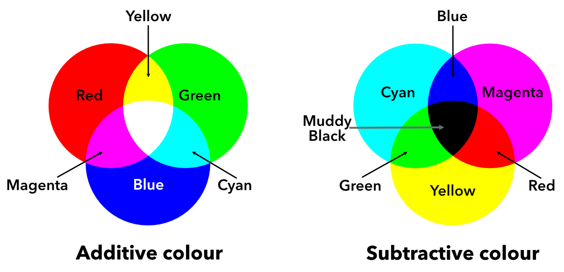
CYMK
Unlike RGB, CYMK is a subtractive color model i.e. the different colors are represented by subtracting some color from white e.g. cyan is white minus red. Cyan, magenta, and white are the complements of red, green and, blue respectively. The fourth black color is added to yield CYMK for better reproduction of colors.
Conversion from RGB to CMYK: C=1−R, M=1−G, Y=1−B.
YUV
These color spaces transform RGB into one brightness channel and two color channels:
- Y (luma): how bright the pixel is. It’s a weighted average of R, G, B; notice green gets the highest weight (0.587) since our eyes are most sensitive to green.
- U and V (chroma): encode the color information as difference signals (blue vs yellow, red vs cyan).
This design was originally for broadcast TV, black-and-white sets used only the Y channel and ignored U/V, while color TVs decoded all three.
\[\begin{aligned} Y &= 0.299R + 0.587G + 0.114B \\ U &= -0.299R - 0.587G + 0.886B \\ V &= 0.701R - 0.587G - 0.114B \end{aligned}\]HSV and HSL
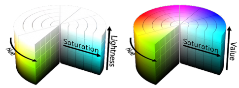
Both HSV (Hue, Saturation, Value) and HSL (Hue, Saturation, Lightness) are cylindrical color models built from RGB. They were designed to be more intuitive. Instead of mixing amounts of red, green, and blue, you pick a color (hue), decide how vivid it should be (saturation), and how bright (value/lightness).
- Hue (0°-360°): the color itself, starting and ending with red.
- Saturation (0-1): how pure the color is. 0 is gray, 1 is fully vivid.
- Value / Lightness (0-1): how bright the color is. 0 is always black. At 1 they both reach white, but full saturation is reached at V=1 for HSV and at L=0.5 for HSL.
Chromaticity
Imagine you’re looking at a red apple in sunlight. Now imagine the same apple in shadow, it’s darker, but your brain still recognizes it as the same red. You instinctively separate the apple’s intrinsic color from the amount of light hitting it. Chromaticity is the mathematical version of this separation: it describes the “color quality” of a pixel independently of its brightness.
The simplest form is rg chromaticity, which normalizes RGB values by their total intensity:
\[r = \frac{R}{R + G + B}, \quad g = \frac{G}{R + G + B}, \quad b = \frac{B}{R + G + B}\]Each channel tells you “what fraction of the total light is red (green / blue)?” Two pixels with the same underlying surface color but different illumination will have similar (r, g, b) ratios, the intensity cancels out.
Since \(r + g + b = 1\), we only need two of the three values. Plotting every possible (r, g) pair produces a right triangle called the rg chromaticity diagram.
Chromaticity is widely used in computer vision: discarding intensity lets algorithms segment objects by material color while staying robust to shadows and illumination gradients.
CIE Color Space
Before understanding CIE Lab (L*a*b*) color space, let’s look at the problems with RGB and HSV. RGB is device-oriented: it describes how much red, green, and blue light a screen emits, not how a human perceives the resulting color. This causes these problems:
Non-uniform perceptual spacing equal numerical steps in RGB do not produce equal perceived color differences. For example, changing blue from (0, 0, 200) to (0, 0, 210) looks like a much smaller change than shifting red from (200, 0, 0) to (210, 0, 0), even though the Euclidean distance is identical. Human eyes are simply more sensitive to some regions of color space than others.
Conflation of luminance and chrominance RGB mixes lightness and color information in all three channels. The human visual system separates these: we are far more sensitive to changes in luminance than to changes in hue or saturation at the same luminance level. RGB gives no direct handle on this separation.
XYZ
XYZ is derived from human visual perception experiments, its color matching functions were calibrated to how the average eye responds to light. Each channel is a linear transformation of RGB and carries color information.
It has three channels:
- X roughly corresponds to red sensation.
- Y corresponds to luminance (brightness).
- Z roughly corresponds to blue sensation.
A convenient 2D slice of XYZ is the xy chromaticity diagram, which normalizes out luminance just like rg chromaticity does for RGB. Plotting x and y for all spectral colors produces the horseshoe-shaped locus.
\[x = \frac{X}{X + Y + Z}, \quad y = \frac{Y}{X + Y + Z}\]But XYZ is linear so equal steps don’t feel equal to the eye. Lab and Luv fix this with non-linear transforms, creating perceptually uniform spaces where Euclidean distance ≈ perceived difference.
CIE Lab
CIE Lab was designed for reflected light e.g. surfaces, prints, and photographs. It addresses both RGB issues by mapping colors into a space calibrated to human perception, decoupling intensity (L*) from chromaticity (a*, b*), and spacing colors so that equal distances feel equally different.
It has three channels:
- L* lightness, ranging from 0 (black) to 100 (white).
- a* green-red axis, ranging from green (-) to red (+).
- b* blue-yellow axis, ranging from blue (-) to yellow (+).
CIE Luv
CIE Luv (L*u*v*) was developed for emitted light e.g. computer screens, TV displays, and other self-luminous devices. It shares the same perceptual uniformity goals as Lab but uses a different chromaticity formulation better suited to additive color mixing.
The three channels are:
- L* lightness, identical to Lab: 0 (black) to 100 (white).
- u* chromaticity coordinate, roughly red-green axis.
- v* chromaticity coordinate, roughly blue-yellow axis.
In practice, Lab is more common in image processing and computer vision, while Luv is often preferred for applications involving display calibration and video processing.
Delta E
Delta E (ΔE) is a single number that quantifies the perceptual difference between two colors. It answers the question: how different do two colors look to a human observer?
Delta E is computed in the CIE Lab color space. The simplest version, ΔE*ab (CIE76), is just the Euclidean distance between two colors in Lab space:
\[\Delta E^{*}_{ab} = \sqrt{(L^{*}_2 - L^{*}_1)^2 + (a^{*}_2 - a^{*}_1)^2 + (b^{*}_2 - b^{*}_1)^2}\]Delta E values can be interpreting as follows.
| ΔE value | Perception |
|---|---|
| < 1 | Not perceptible by human eyes |
| 1 – 2 | Perceptible only on close observation |
| 2 – 10 | Perceptible at a glance |
| 11 – 49 | Colors are more similar than opposite |
| 100 | Colors are exact opposites |
The original CIE76 was further improved by following standards.
- ΔE*94: Adds weighting functions for chroma and hue to better match human perception.
- ΔE*00: The current industry standard. Introduces corrections for lightness, chroma, hue, and a rotation term for the blue region.
where \(S_L\), \(S_C\), \(S_H\) are weighting functions and \(R_T\) is the rotation term.
QUIZ: Test Your Knowledge
References & Further Readings:
- Color space - Wikipedia
- Color model - Wikipedia
- Fundamental concepts of processing and image analysis
- Introduction to computer vision
- Color difference - Wikipedia
- CIELAB color space - Wikipedia
- CIE 1931 color space - Wikipedia
- YUV - Wikipedia
- CIE Luv color space - Wikipedia
- CIE xy chromaticity diagram
- Visible spectrum - Wikipedia
Comments