We often look for summary statistics during EDA (Exploratory Data Analysis). But, sometimes these statistics may give us wrong interpretation of the data. In 1973, a statistician Francis Anscombe demonstrated it with the help of four datasets known as Anscombe’s quartet.
>> import seaborn as sns

# Load the example dataset for Anscombe's quartet
>> df = sns.load_dataset('anscombe')
>> df1 = df[:11]  # extract first dataset
>> df2 = df[11:22]  # second dataset
>> df1.head()
  dataset     x     y
0       I  10.0  8.04
1       I   8.0  6.95
2       I  13.0  7.58
3       I   9.0  8.81
4       I  11.0  8.33
>> df2.head()
   dataset     x     y
11      II  10.0  9.14
12      II   8.0  8.14
13      II  13.0  8.74
14      II   9.0  8.77
15      II  11.0  9.26
Now, let’s look at the statistical summary:
>> df1.describe()
               x          y
count  11.000000  11.000000
mean    9.000000   7.500909
std     3.316625   2.031568
min     4.000000   4.260000
25%     6.500000   6.315000
50%     9.000000   7.580000
75%    11.500000   8.570000
max    14.000000  10.840000
>> df2.describe()
               x          y
count  11.000000  11.000000
mean    9.000000   7.500909
std     3.316625   2.031657
min     4.000000   3.100000
25%     6.500000   6.695000
50%     9.000000   8.140000
75%    11.500000   8.950000
max    14.000000   9.260000
>> df1.corr()
          x         y
x  1.000000  0.816421
y  0.816421  1.000000
>> df2.corr()
          x         y
x  1.000000  0.816237
y  0.816237  1.000000
All the datasets have the same statistical summary: mean, standard deviation, same correlation between x and y (3 decimal places). Now, let’s visualize the datasets:
# Show the results of a linear regression within each dataset
>> sns.lmplot(x='x', y='y', col='dataset', hue='dataset', data=df,
           col_wrap=2, ci=None, palette='muted', size=4,
           scatter_kws={'s': 50, 'alpha': 1})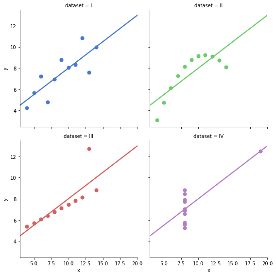
OMG, these datasets are so much different while they seemed the same by looking at the statistical summary.
Now, we realize the importance of graphing data before analyzing it.
Hence, visualization is a crucial and integral part of exploratory data analysis.
References:
Comments